A lot of social media platforms can display a rich preview for your website when sharing a link (most notably, a cover image, a title and a description).
Quartz can also dynamically generate and use new cover images for every page to be used in link previews on social media for you.
Showcase
After enabling the CustomOgImages emitter plugin, the social media link preview for Authoring Content looks like this:
| Light | Dark |
|---|---|
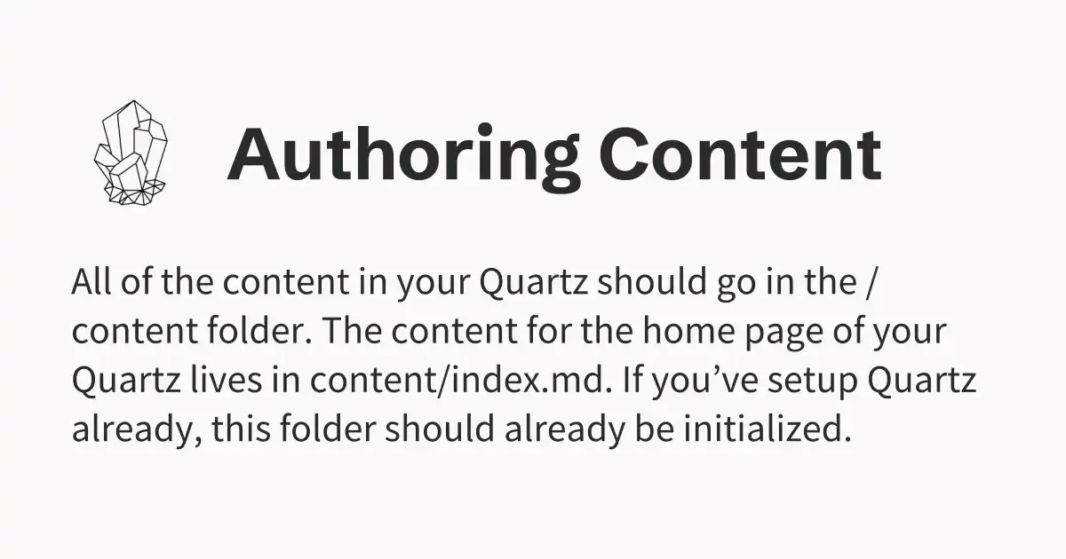 | 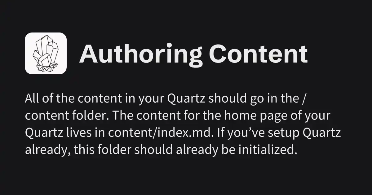 |
Configuration
This functionality is provided by the CustomOgImages plugin. See the plugin page for customization options.